Aurora theme
Aurora is the violet sibling of Lagoon: the same airy, product-led landing-page structure, but lit by an electric-blue-to-violet gradient over lavender sections and midnight panels. It is set in tightly-tracked Inter (already shipped by the Sylius shop, so no extra font file is needed).
Desktop (1440 px)
| Scheme | Homepage | Product page | Cart |
|---|---|---|---|
| Light | 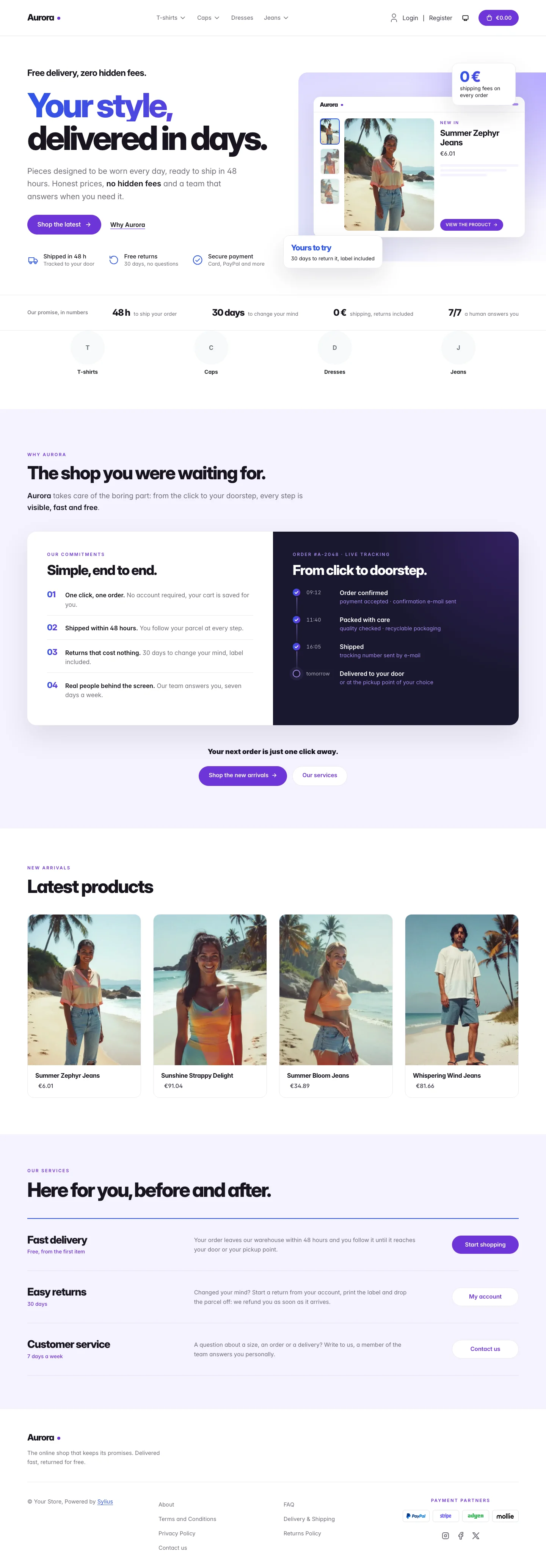 | 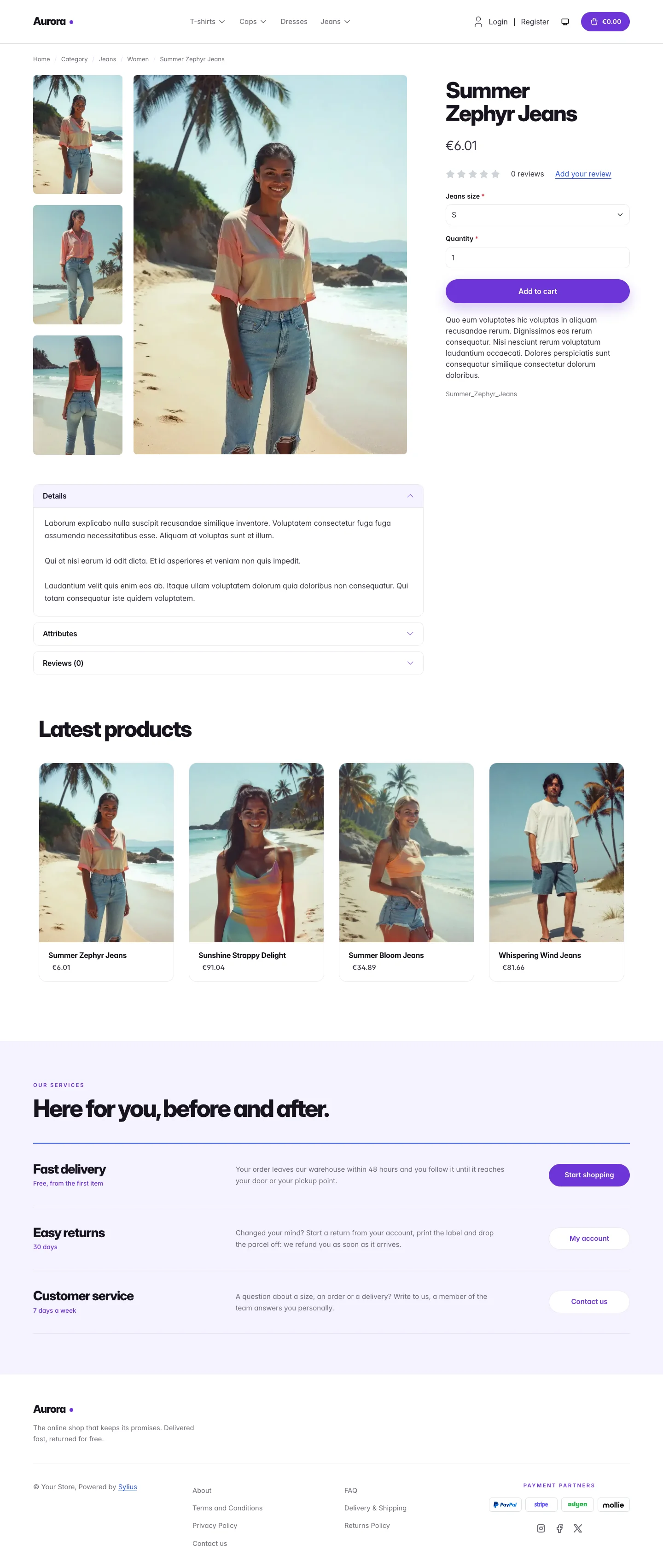 | 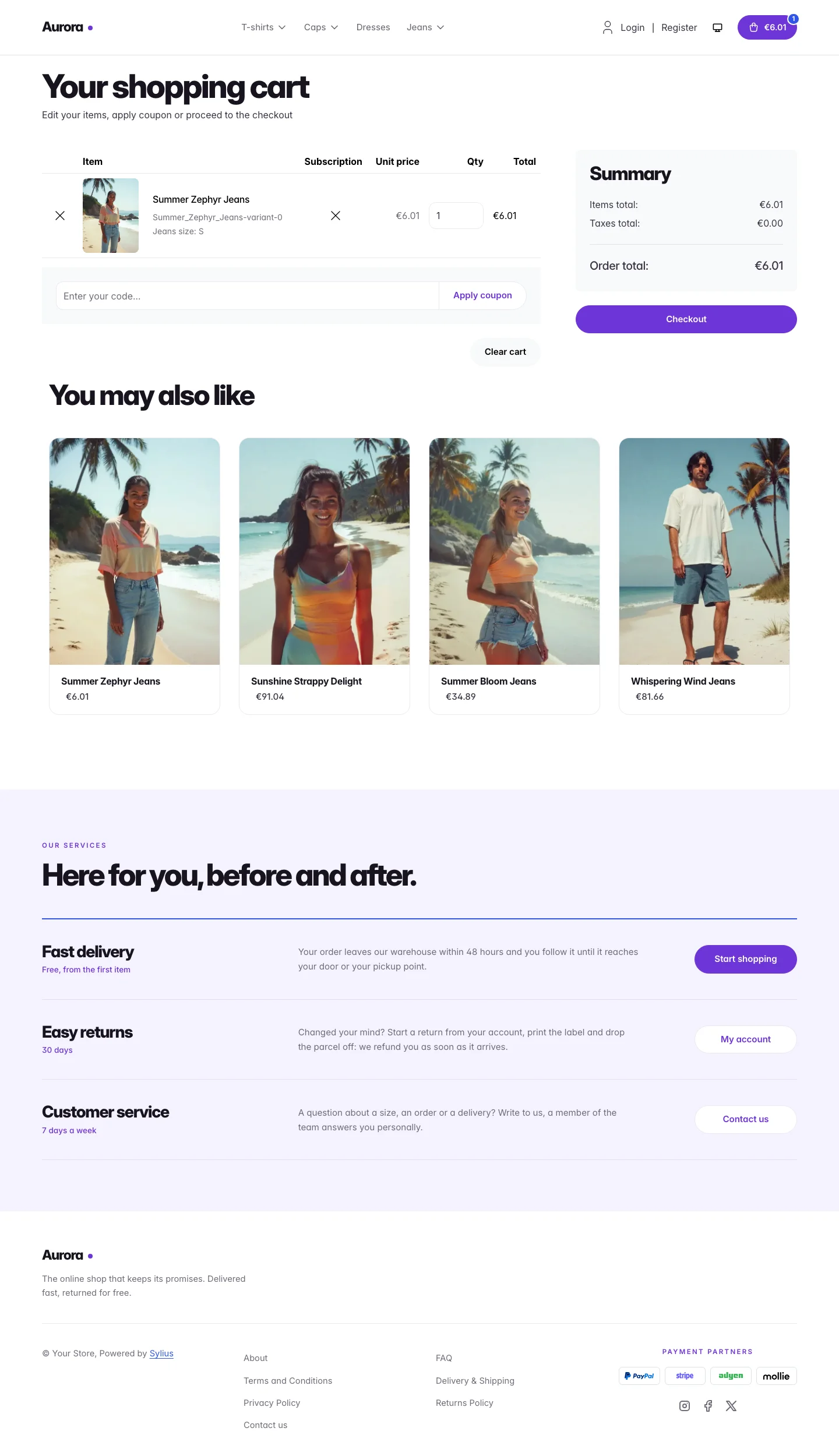 |
| Dark | 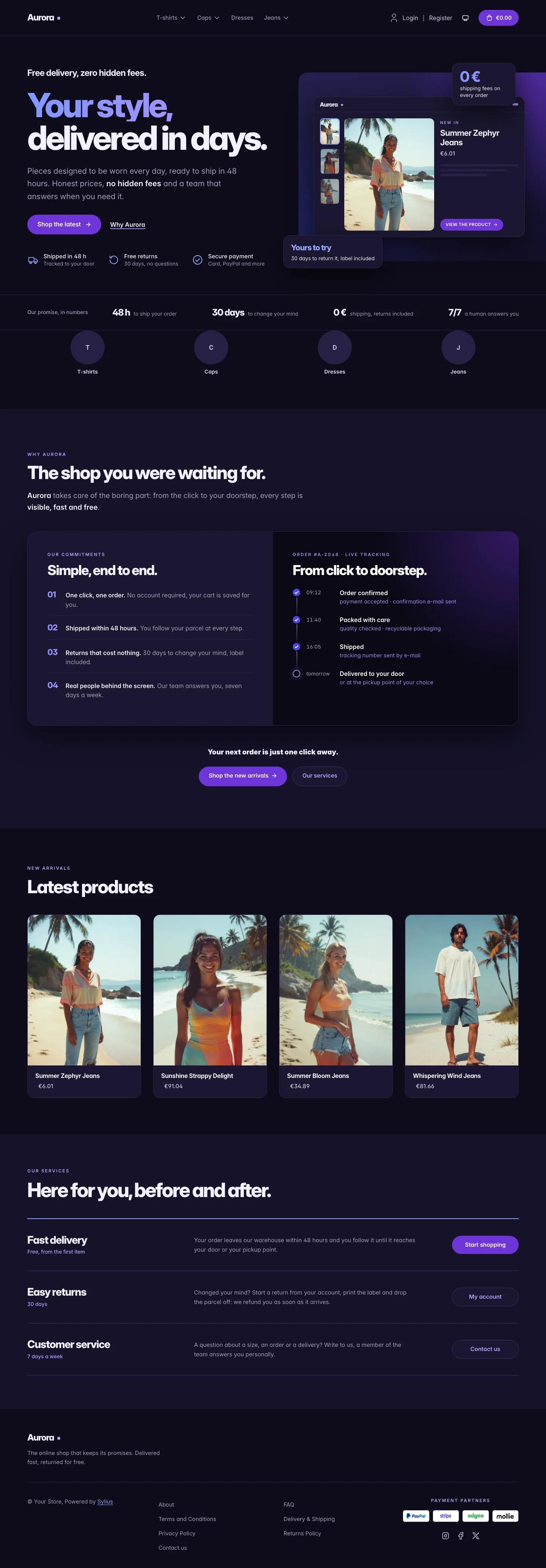 | 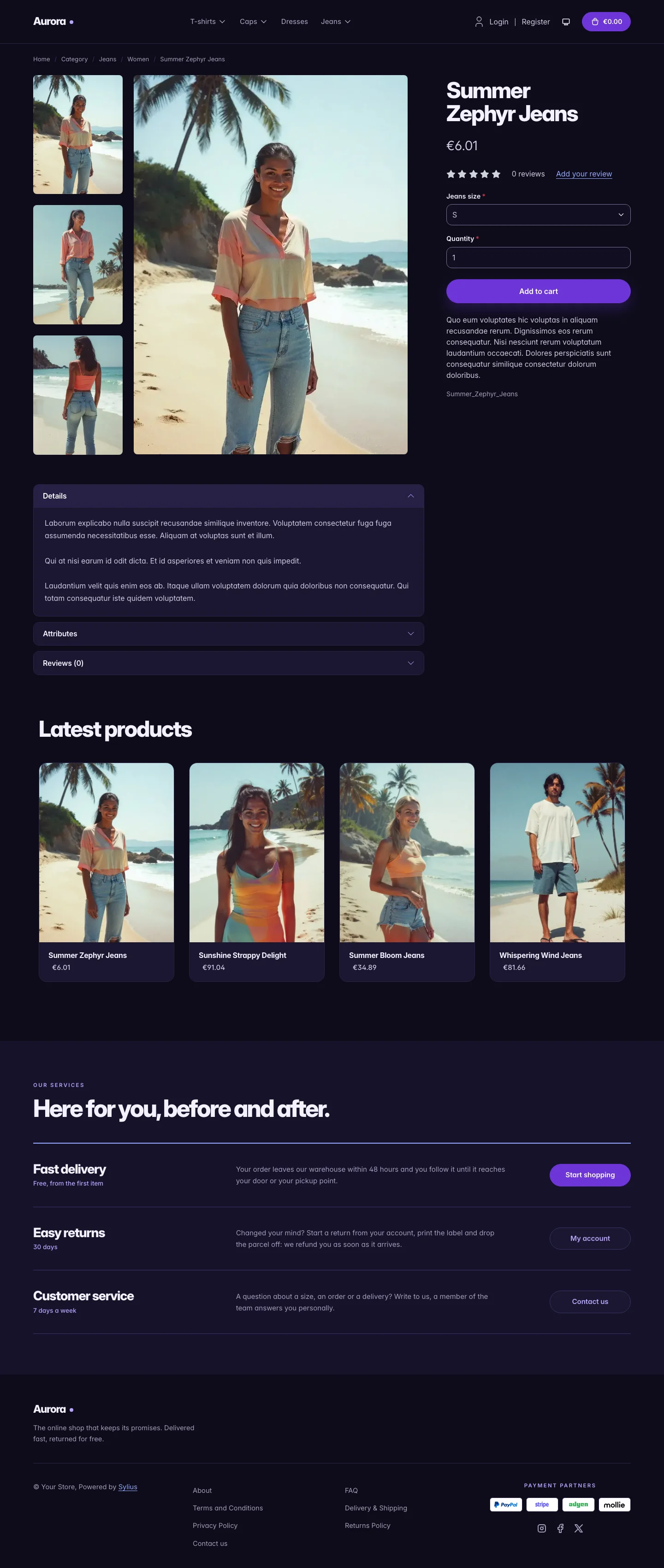 | 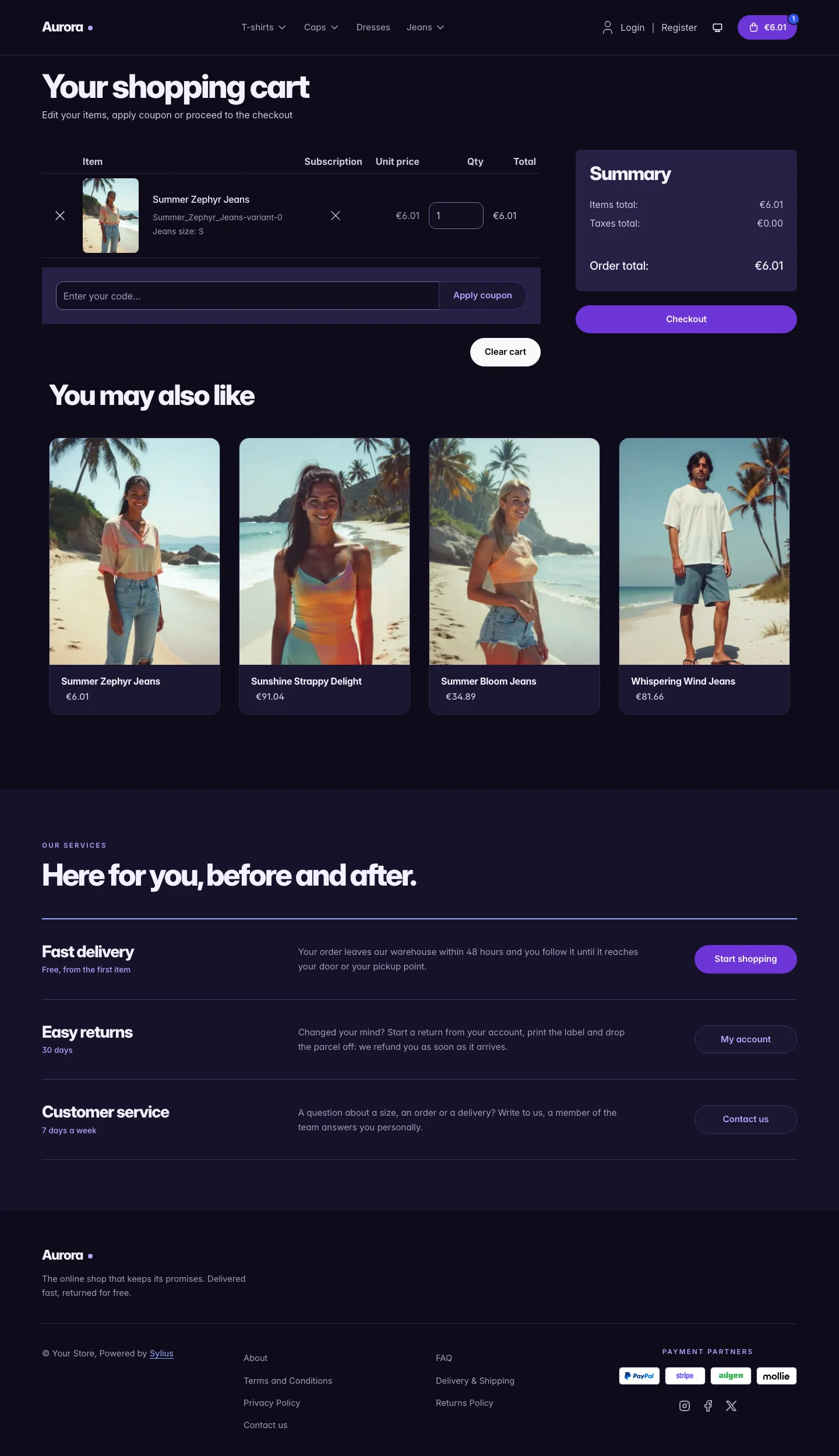 |
Wide screen (2560 px)
| Scheme | Homepage | Product page | Cart |
|---|---|---|---|
| Light | 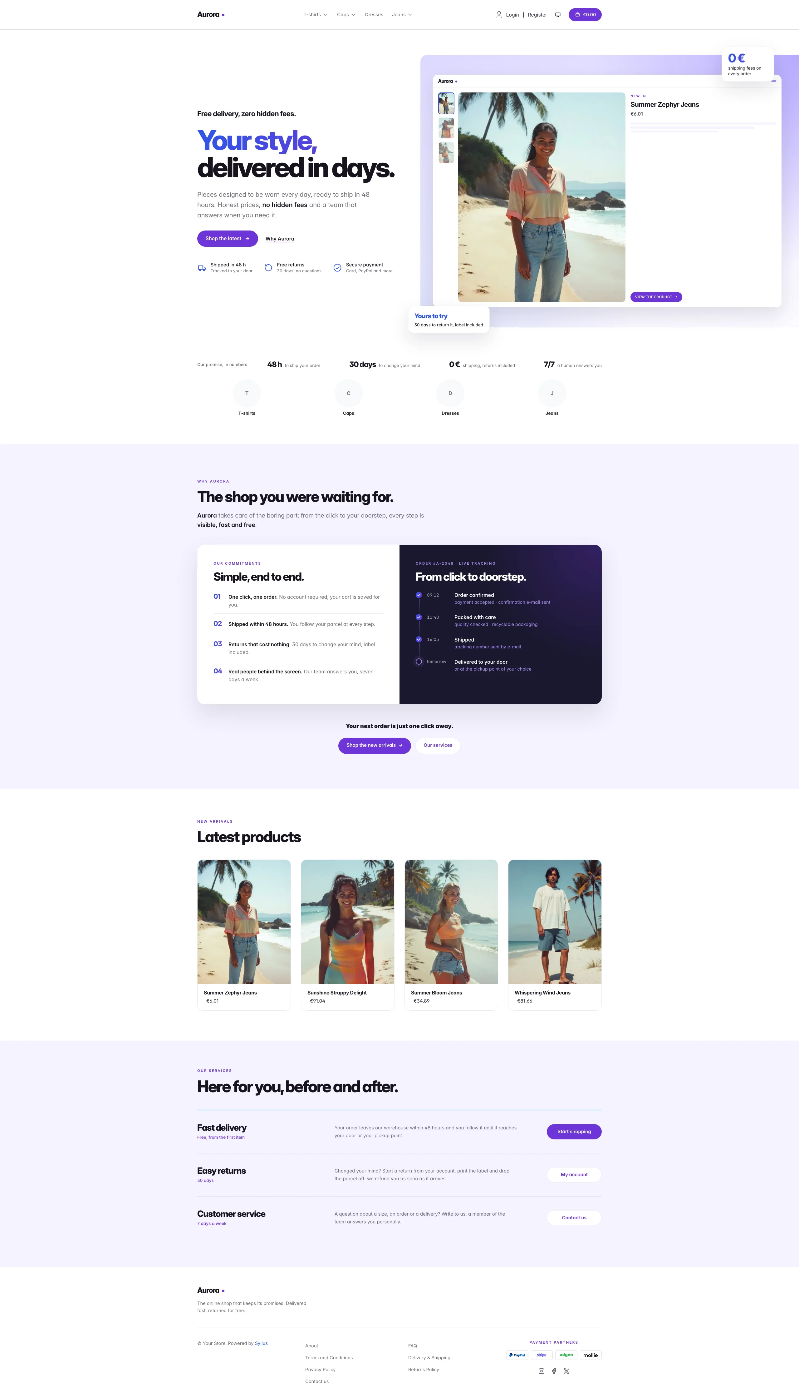 | 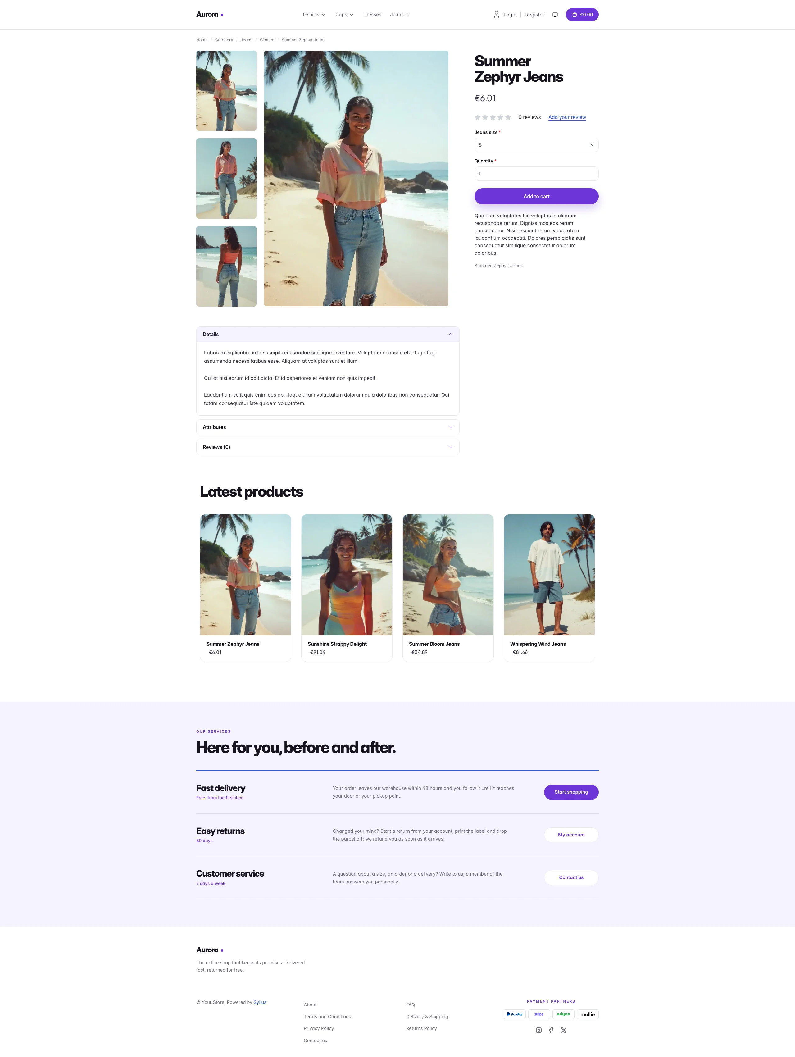 | 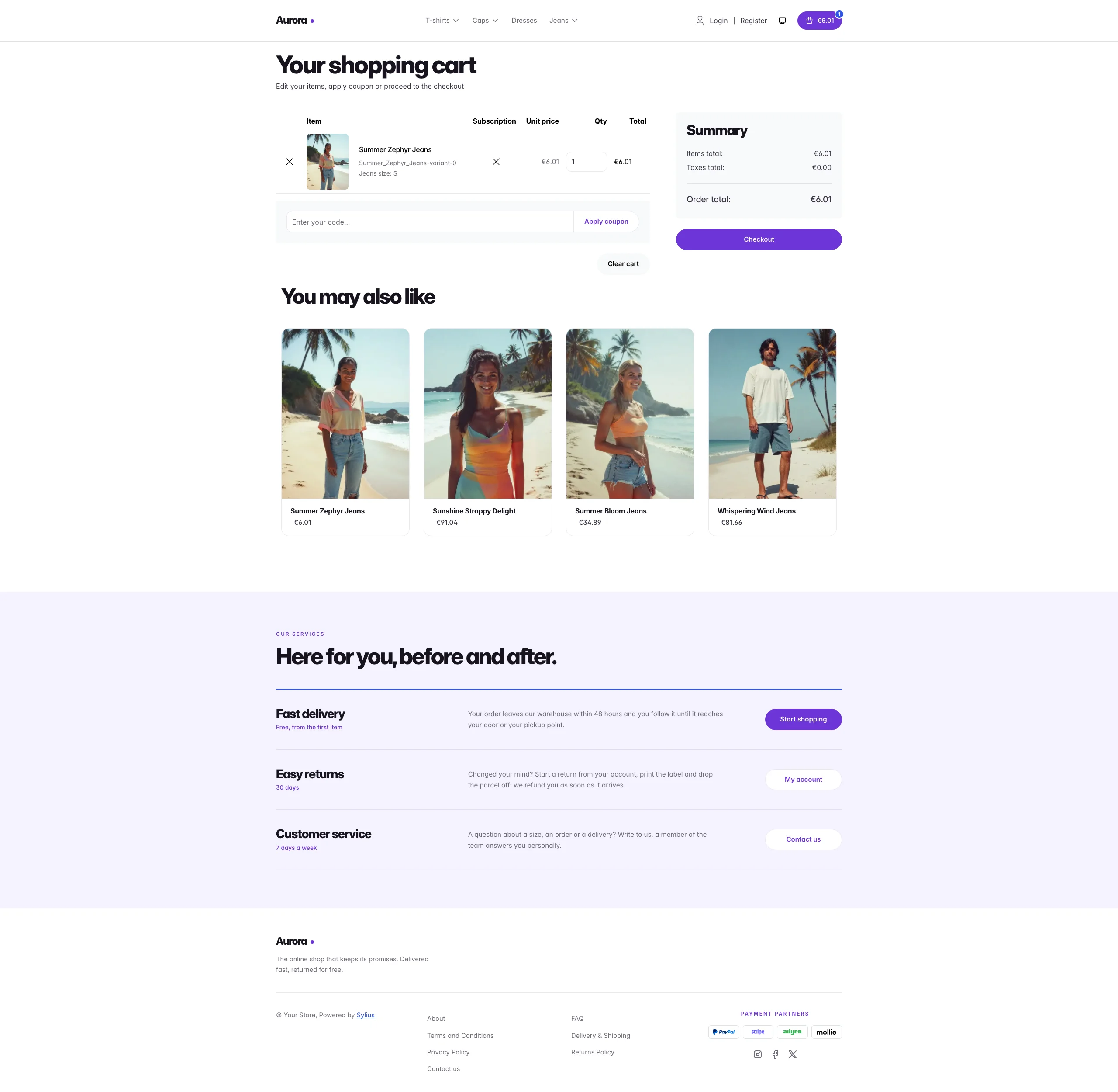 |
| Dark | 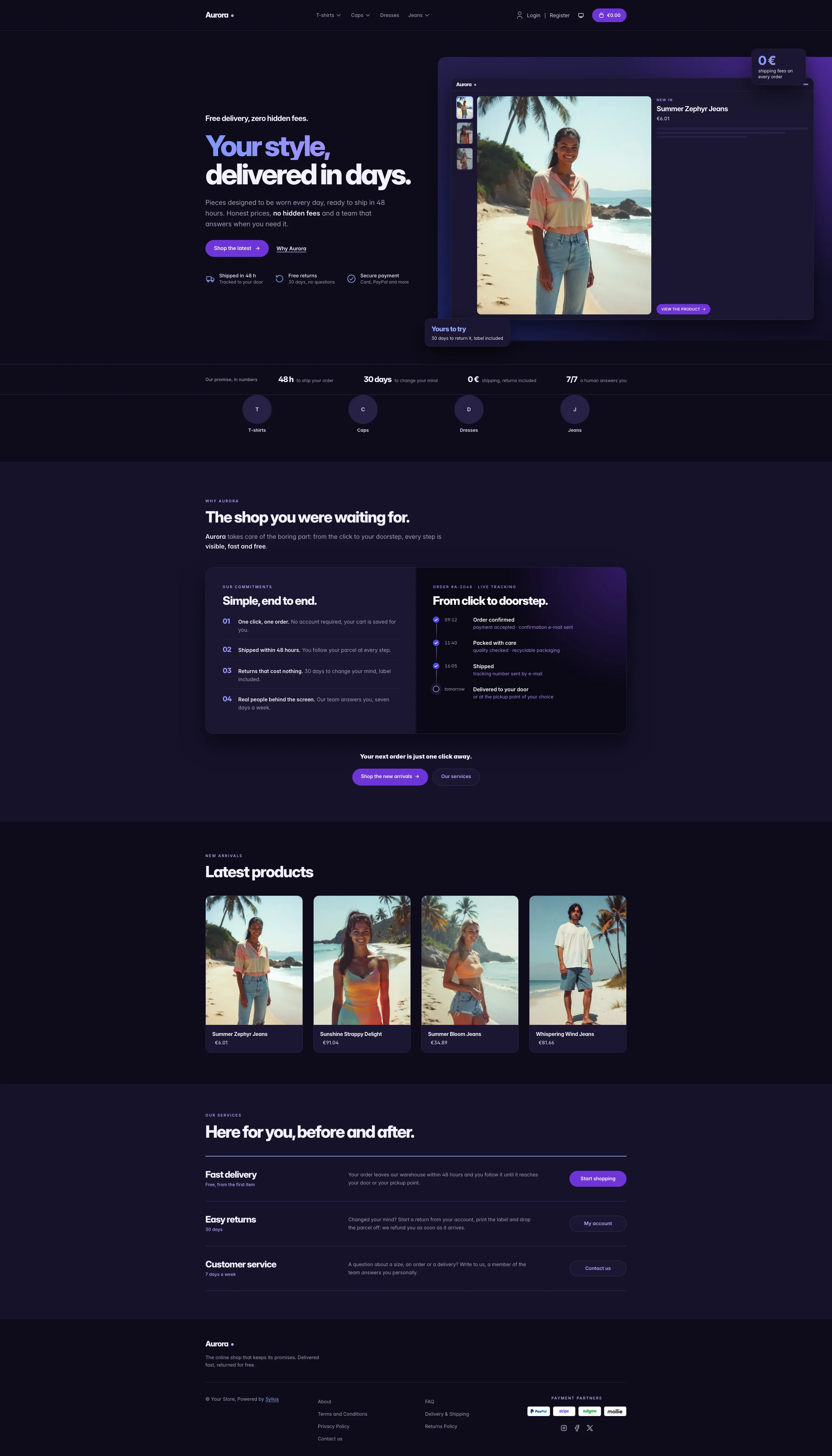 | 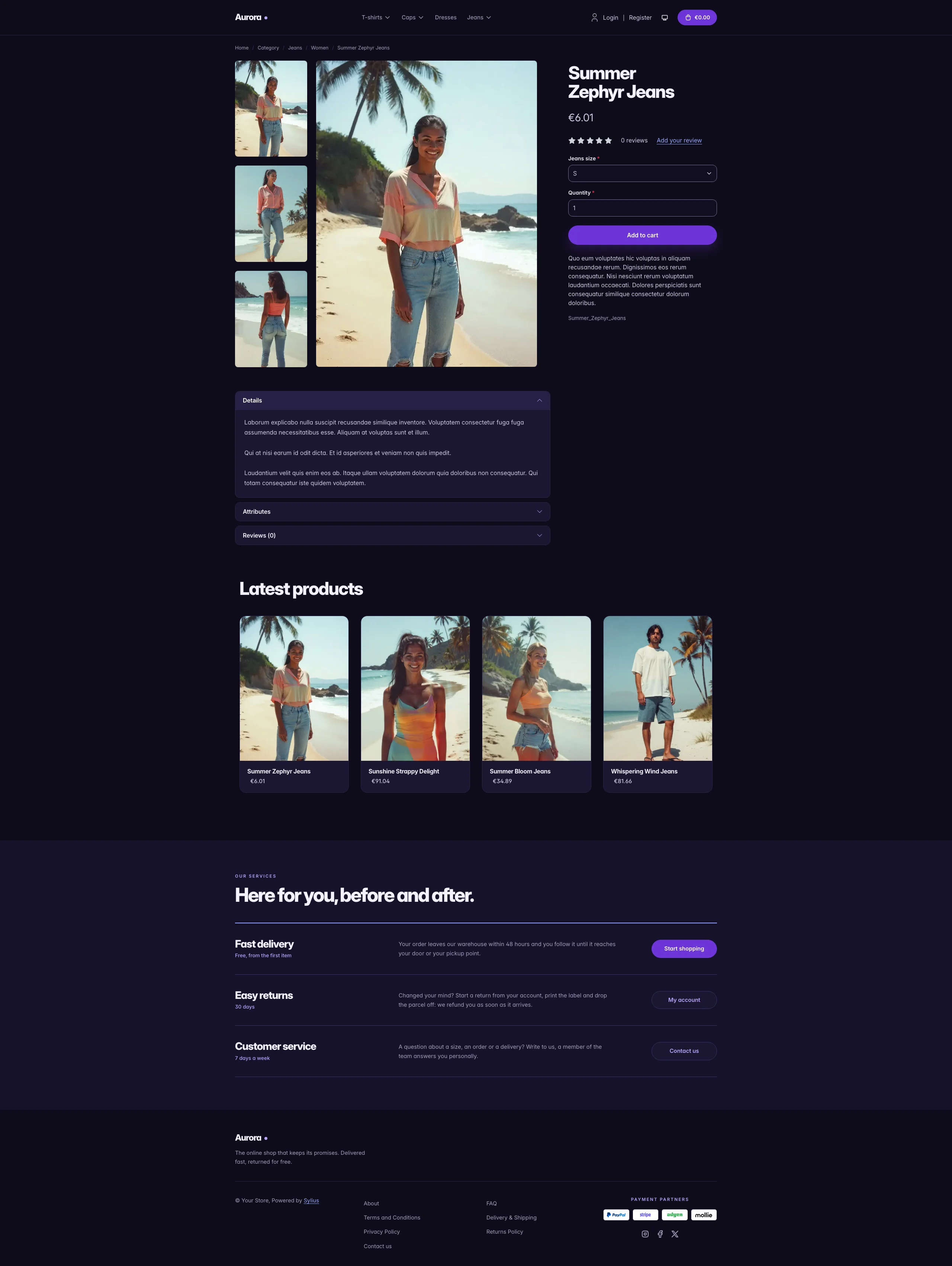 | 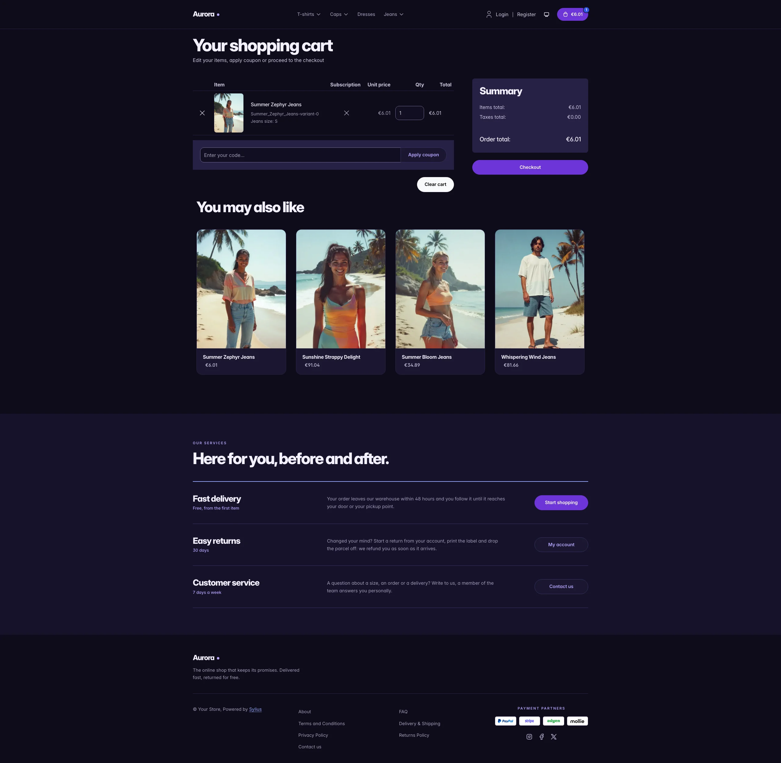 |
Mobile (390 px)
| Scheme | Homepage | Product page | Cart |
|---|---|---|---|
| Light |  |  |  |
| Dark |  |  |  |
- Palette — electric blue (
#2F55E8), violet (#6D35D6), midnight (#1A1830) and lavender (#F4F2FD) on a white background. The blue-to-violet gradient is the theme signature (headline, figures,.aurora-btn-glow). - Dark scheme — the aurora at night: an indigo-black page (
#0E0C1A, cards#1A1730), violet buttons kept with lighter violet (#BAA4FF) and blue (#93A9FF) for text and icons, a brighter gradient for the headline and figures, and a night-side journey panel darker than the page. - Components — violet pill buttons (white pills with violet text for secondary actions), white product cards with the image flush to the top that lift on hover (the whole card is clickable, on the homepage and on category pages alike), quiet text-only breadcrumbs, a violet cart pill with a blue item counter, a full-width violet add-to-cart button, and no default header top bar.
- Homepage — a split hero whose first headline line glows from blue to
violet, with three reassurance items and a lavender panel that bleeds off the
page edge. It holds a miniature product page: thumbnails of the three
latest products of the channel and the newest one in focus, with its real
image, name and price. A proof strip of key numbers follows (shipping
delay, return period, fees, support). The promise block (
theme_promisehookable) sits on a lavender background: a split card with four numbered commitments on white and the journey of an order as a timeline on midnight (the next step softly pulses), followed by two calls to action. Then come the four latest products; the deals and new collection blocks are hidden. - Footer — a lavender services band (delivery, returns, customer service: one row each, with a tag, a description and a button to the storefront, the customer account and the contact page) above a light footer with the Aurora wordmark and Sylius links.
- Product page — the price sits directly below the product name, before reviews.
- Checkout — the checkout header uses the Aurora wordmark and responsive category navigation.
- Translations — every Aurora-specific text lives in its own
auroratranslation domain (translations/aurora.en.yamlandaurora.fr.yaml), so it can be edited or translated without touching the templates. - Accessibility — visible blue focus rings, decorative mockups hidden from assistive technologies, and no motion for visitors who prefer reduced motion.
Aurora or Lagoon?
Section titled “Aurora or Lagoon?”| Lagoon | Aurora | |
|---|---|---|
| Mood | deep-water teal and aqua | electric blue, violet and midnight |
| Hero visual | storefront window, one product | miniature product page, three products and a price |
| Under the hero | — | proof strip of key numbers |
| Promise | “You replace / You keep” comparison | numbered commitments and an order timeline, same split card |
| Footer | dark band with “how it works” steps | lavender services rows with calls to action |
| Product cards | white cards, mint image well | white cards, lavender image well, violet title on hover |
Install it with:
castor sylius:theme:setup aurora