Canvas theme
Canvas gives the storefront a clean, editorial look, with warm neutral colors, squared corners and a refined pairing of Jost (body) and Cormorant Garamond (headings).
Desktop (1440 px)
| Scheme | Homepage | Product page | Cart |
|---|---|---|---|
| Light | 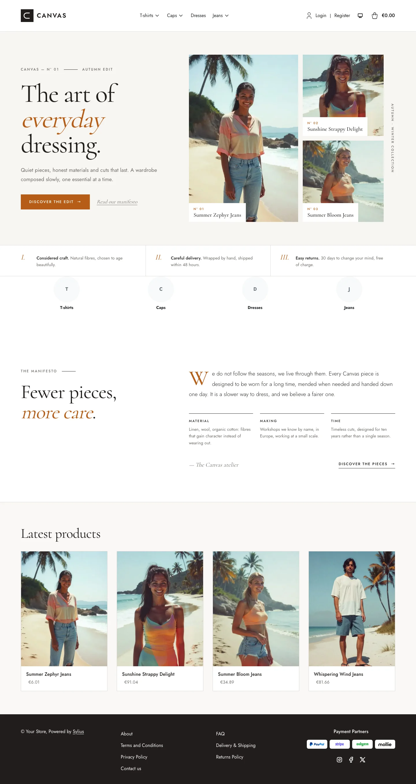 | 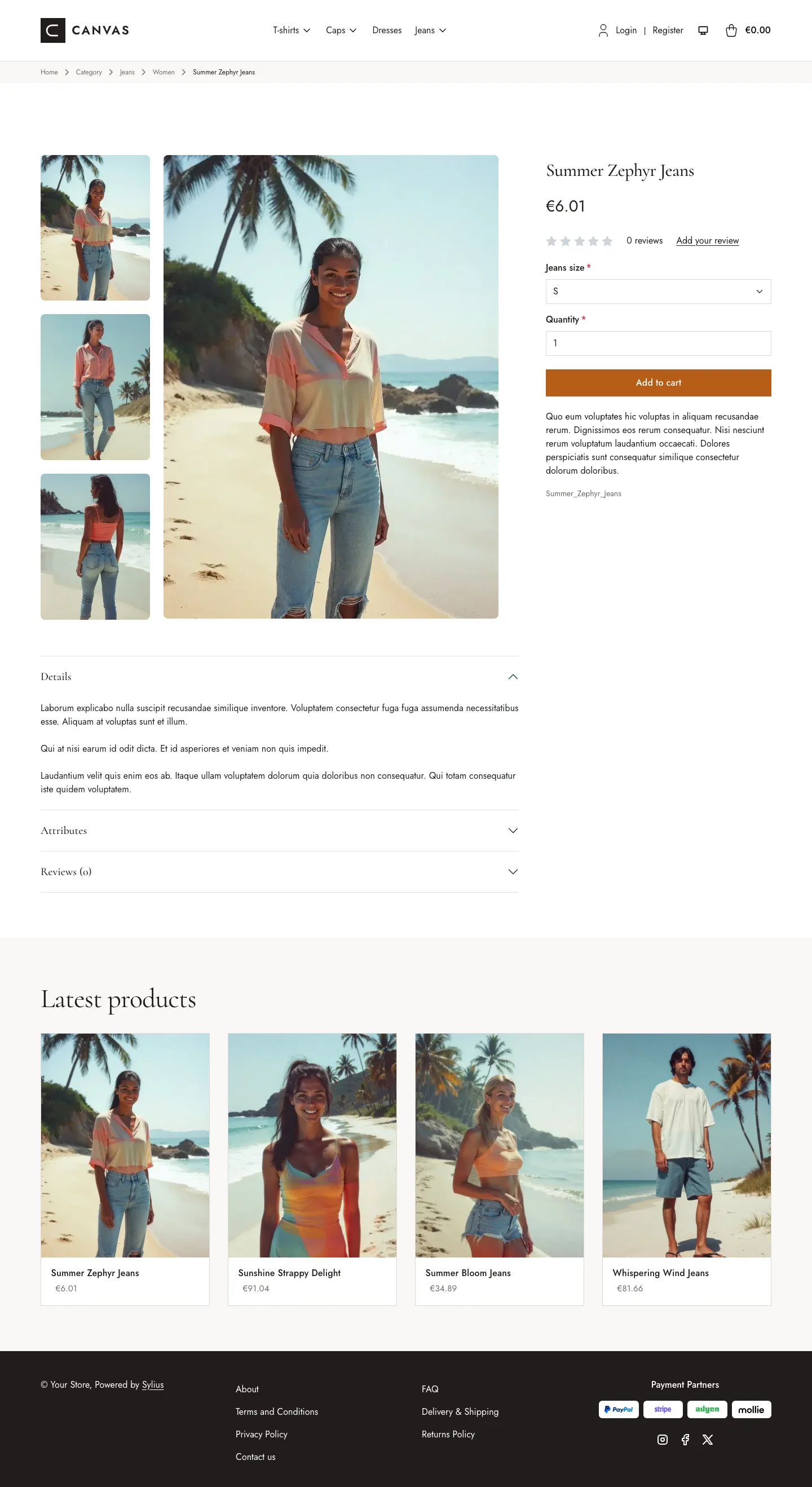 | 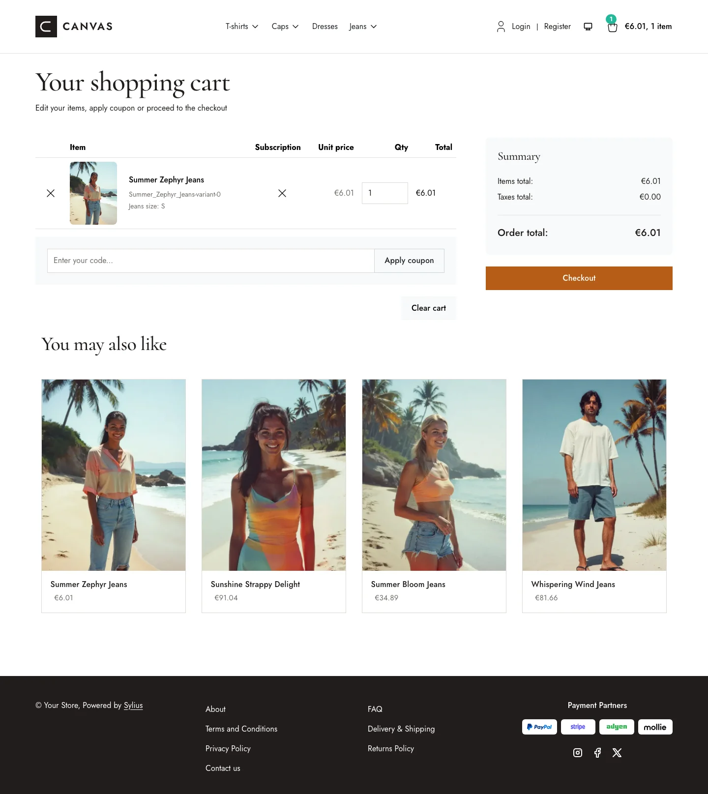 |
| Dark | 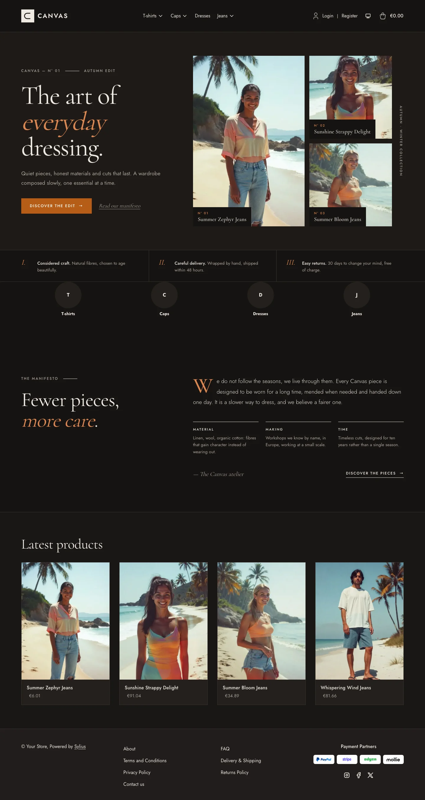 | 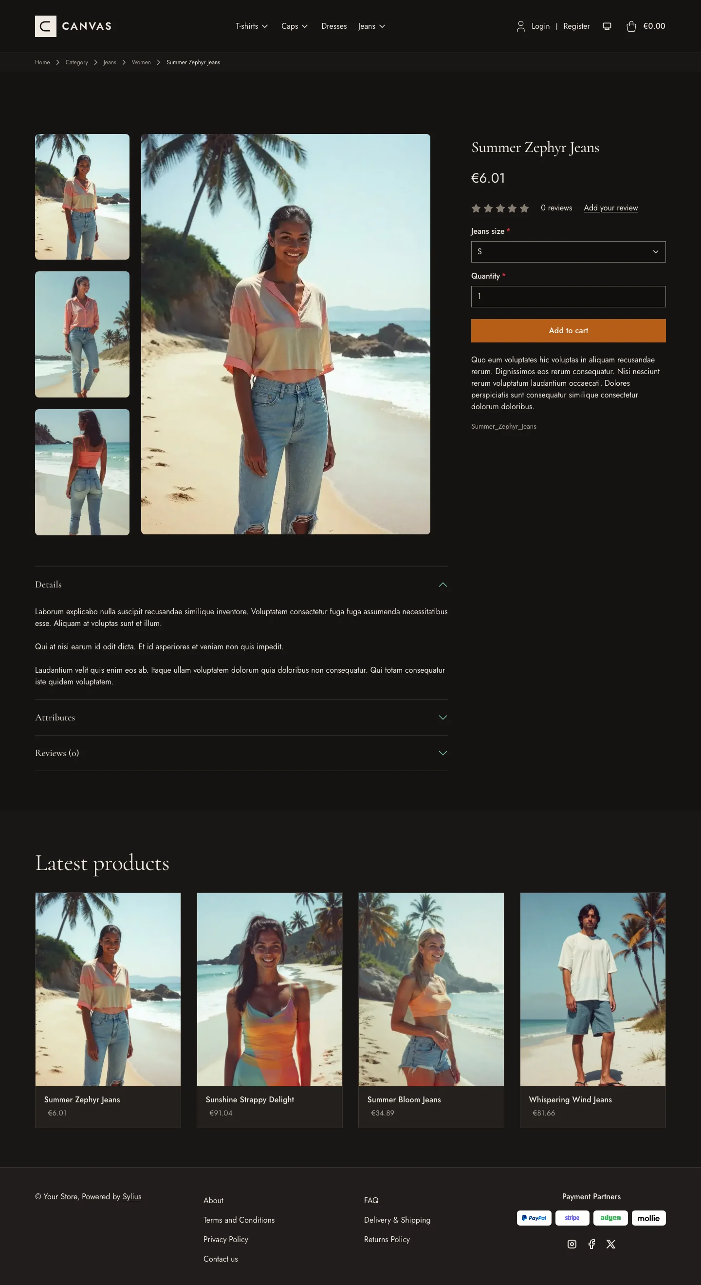 | 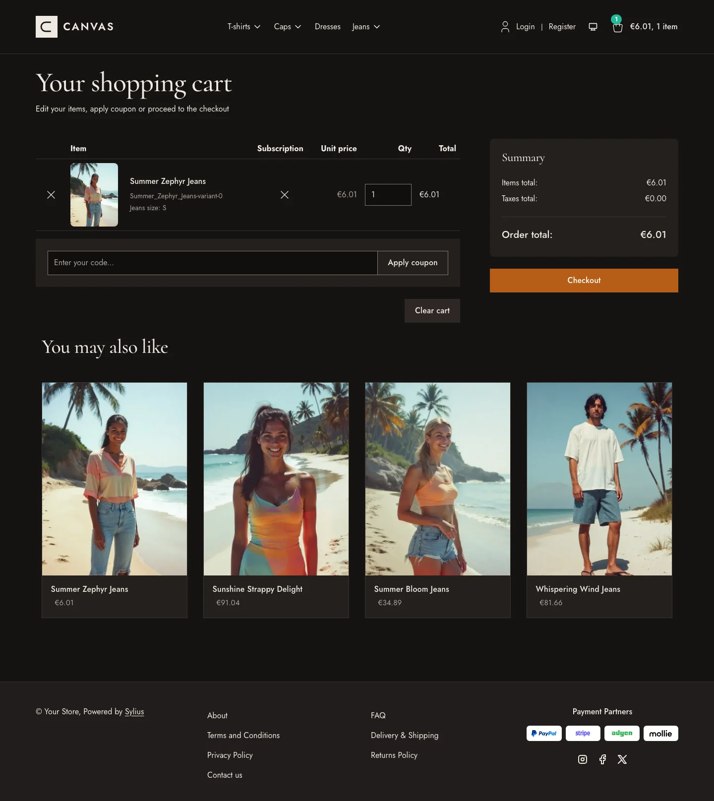 |
Wide screen (2560 px)
| Scheme | Homepage | Product page | Cart |
|---|---|---|---|
| Light | 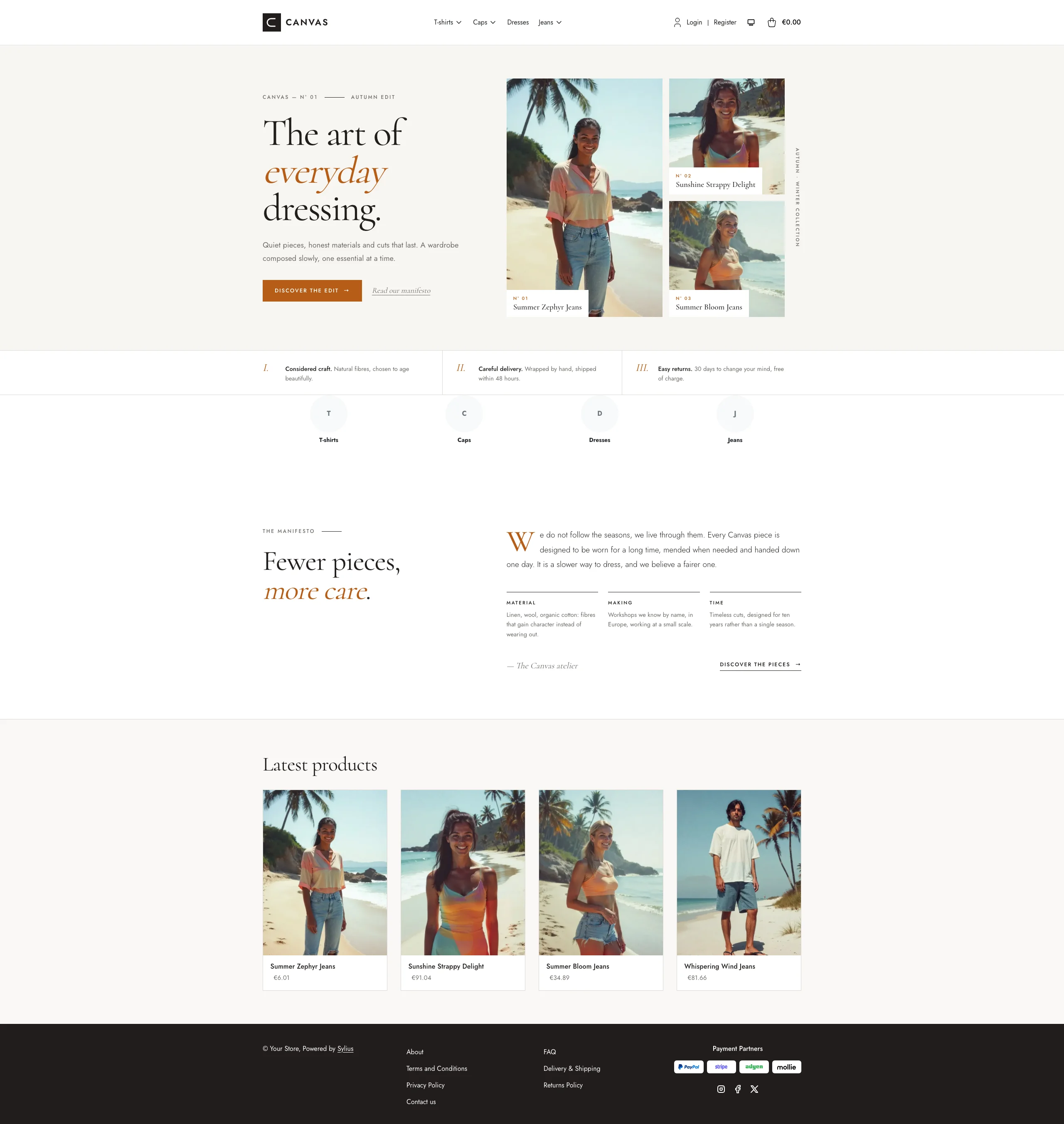 | 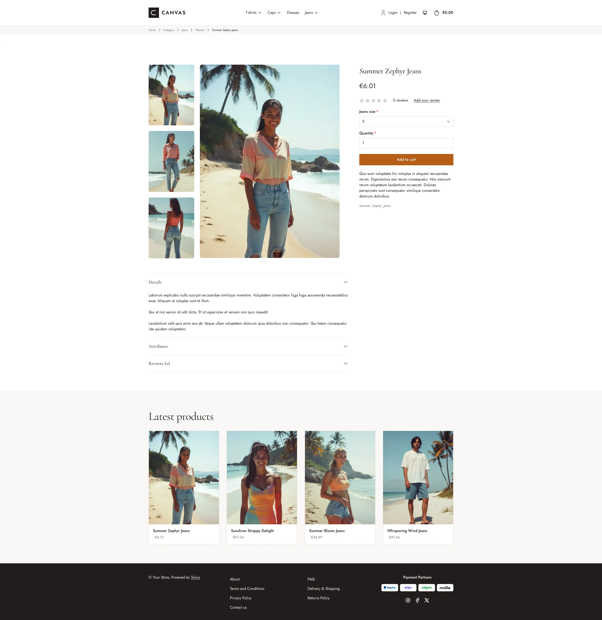 | 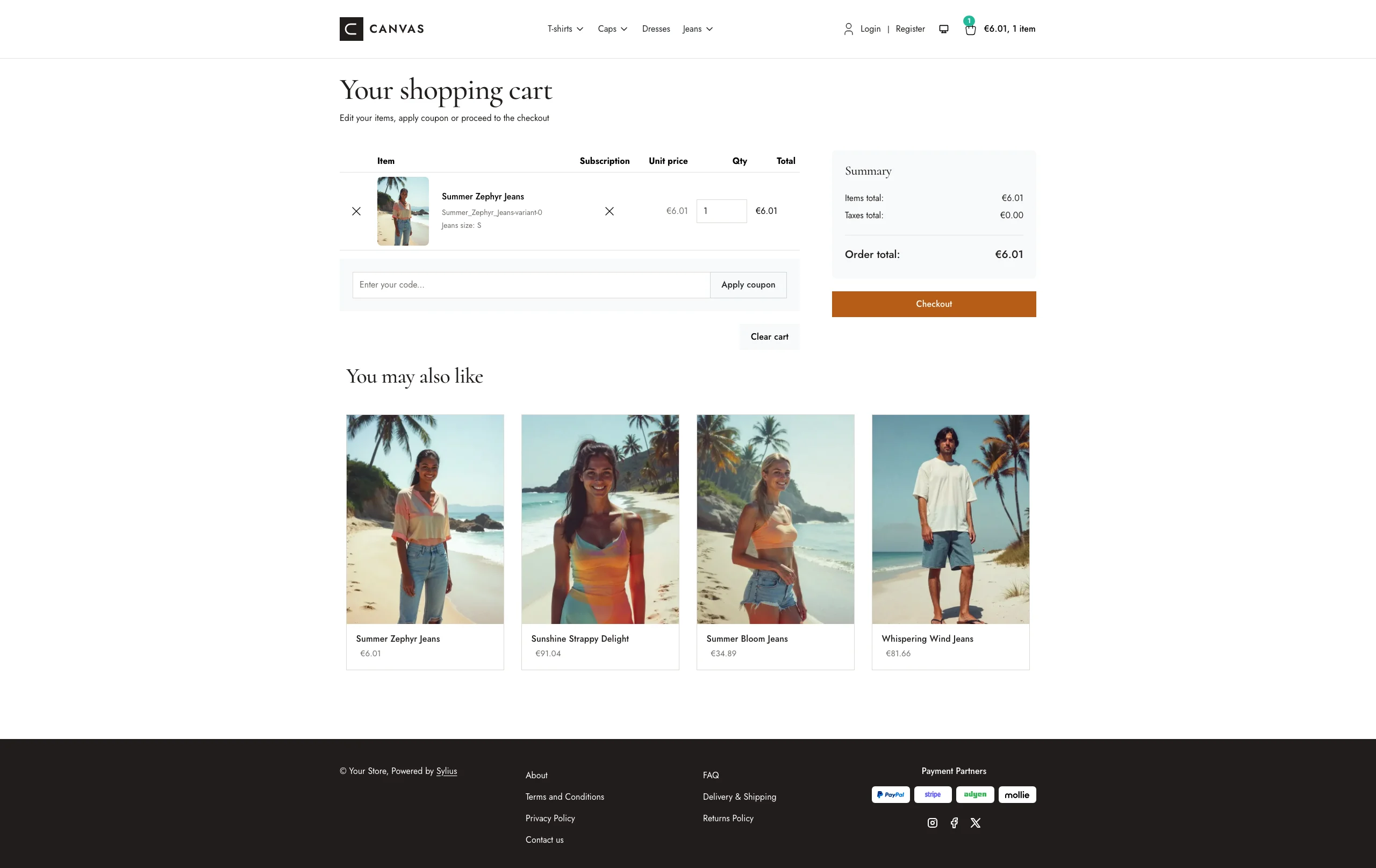 |
| Dark | 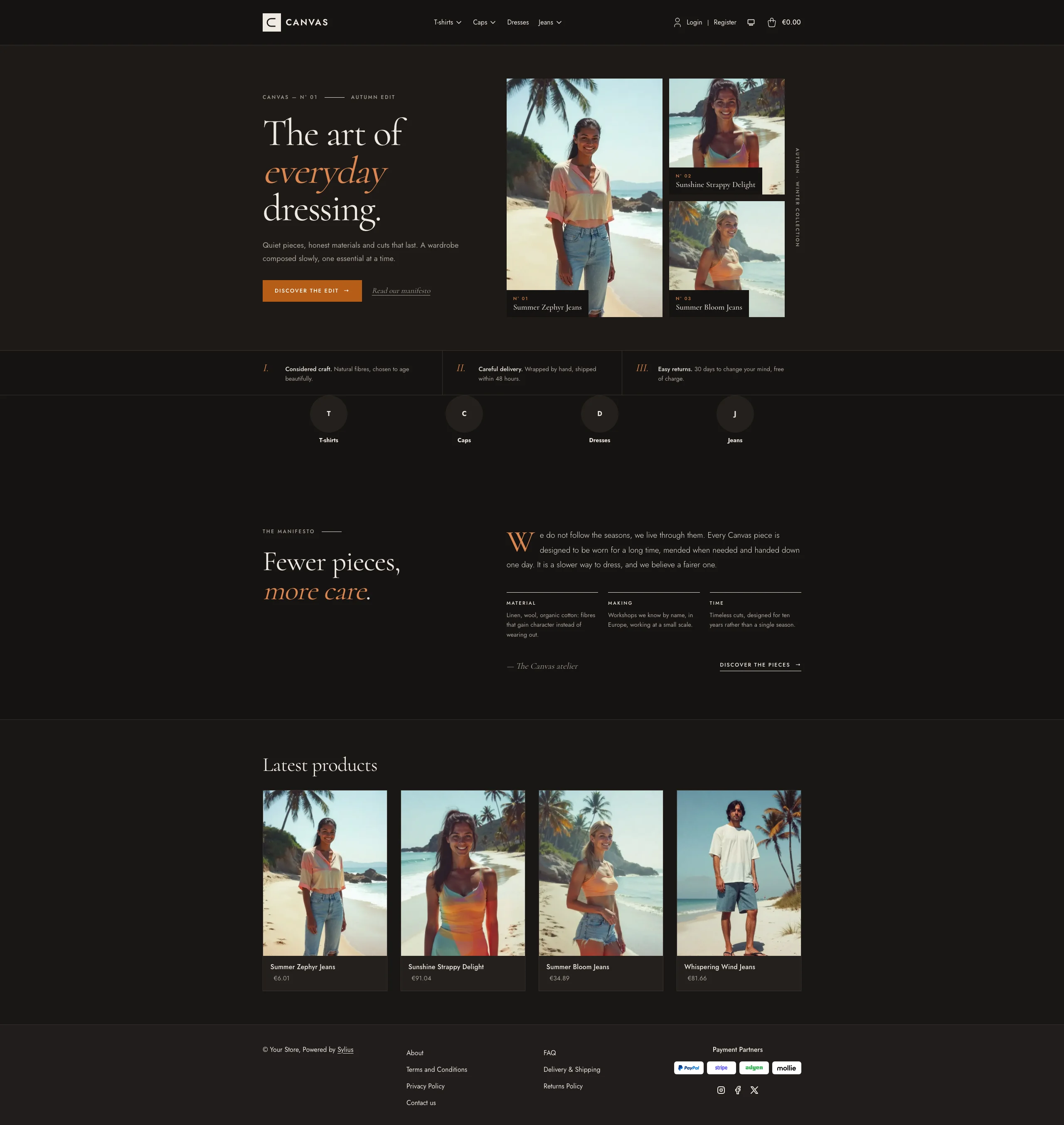 | 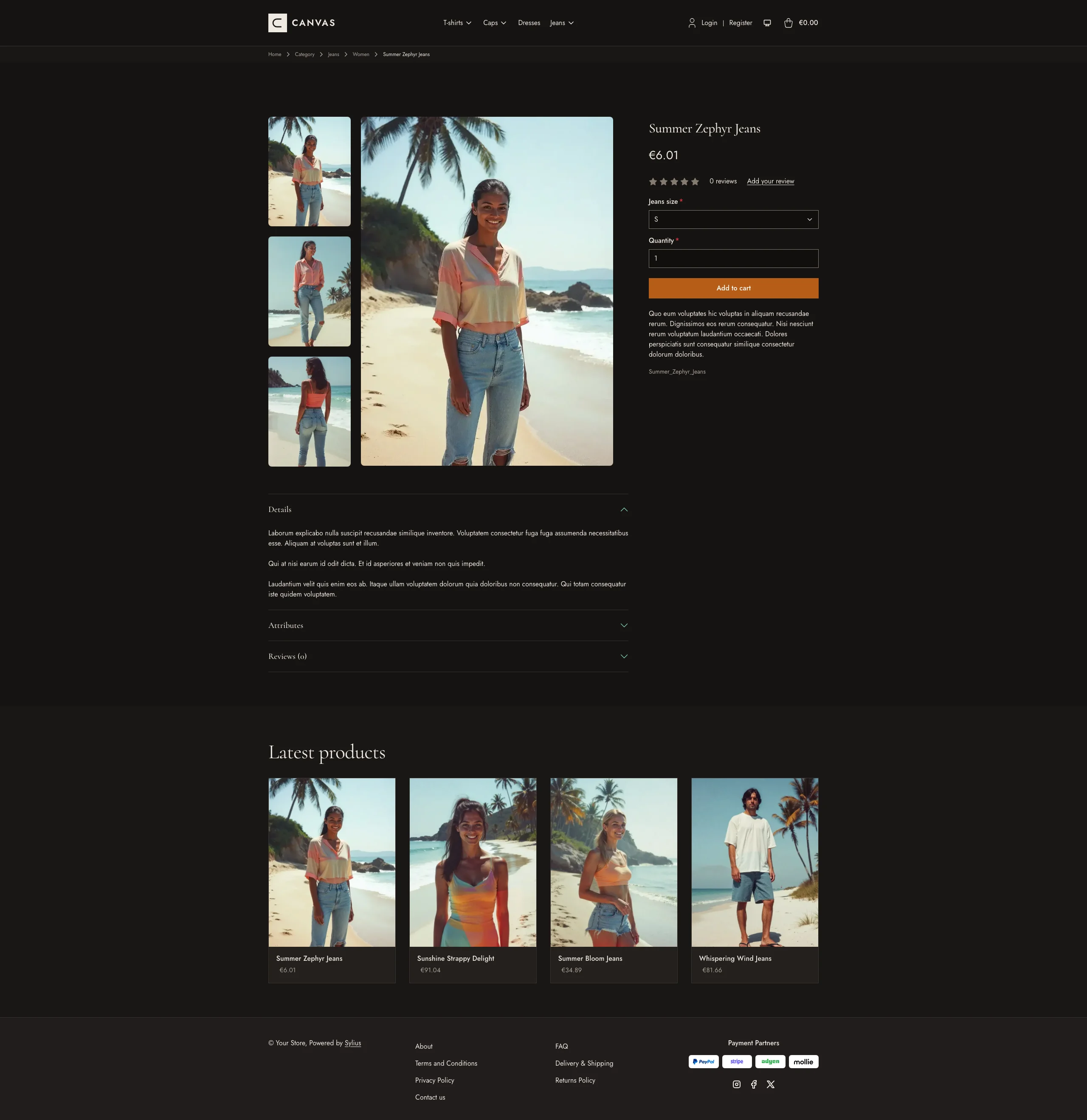 | 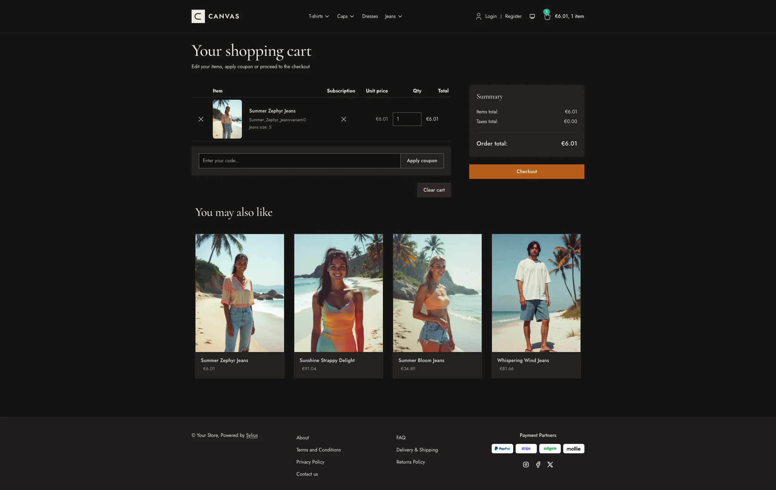 |
Mobile (390 px)
| Scheme | Homepage | Product page | Cart |
|---|---|---|---|
| Light |  |  |  |
| Dark |  |  |  |
The theme restyles the shop through SCSS overrides and Sylius Twig hooks:
- Palette — charcoal (
#211D1B), paper (#F7F6F3) and off-white (#FAF8F6) neutrals, with a terracotta accent (#B75D17) for primary buttons. - Dark scheme — the gallery after hours: warm umber surfaces one step lighter per level (page
#161311, cards#24201D), ivory ink (#EFE9E1), terracotta buttons kept and a lighter terracotta (#DB8650) for accented words; the charcoal footer becomes a lighter band than the page. - Layout — squared corners everywhere (no border radius), minimal borders and generous spacing; the footer is rendered in dark charcoal.
- Product cards — square, hairline-bordered cards without shadow, the image flush to the top and a slow zoom; the border turns charcoal and the name terracotta on hover. The whole card is clickable, on the homepage and on category pages alike.
- Header — the default top bar and navbar are replaced by a single taxon navigation.
- Checkout — the checkout header uses the Canvas wordmark and category navigation.
- Branding — a dedicated Canvas wordmark appears in the header; the footer has no logo, and breadcrumbs stay text-only.
- Homepage — an editorial “magazine cover” hero: a large Cormorant headline
with a terracotta italic accent, a call to action, and a collage of the
three latest products of the channel (real images, numbered captions, no
external image); then a strip of three numbered commitments, an editorial
manifesto with a drop cap and three notes (the promise block, through the
theme_promisehookable, linked from the hero) and the four latest products with squared pictures. The deals and collection blocks are removed. - Product page — a full-width breadcrumb band, the price directly below the product name and before reviews, a full-width add-to-cart button, and a listing of associated products (or latest products when there are none).
- Typography — Cormorant Garamond (300–700) and Jost (100–900) are loaded as variable fonts, so every weight is the real one.
- Translations — the homepage texts live in a
canvastranslation domain (translations/canvas.en.yamlandcanvas.fr.yaml). - Login page — a split-screen layout with a full-height image beside the login/register panel.
Install it with:
castor sylius:theme:setup canvas